Animal Crossing

Overview
These data are from the #TidyTuesday (05 May 2020) project. Tidy Tuesday is a weekly data project aimed at the R ecosystem. As this project was borne out of the R4DS Online Learning Community and the R for Data Science textbook, an emphasis was placed on understanding how to summarize and arrange data to make meaningful charts with {ggplot2}, {tidyr}, {dplyr}, and other tools in the {tidyverse} ecosystem.
The intent of Tidy Tuesday is to provide a safe and supportive forum for individuals to practice their wrangling and data visualization skills independent of drawing conclusions. While we understand that the two are related, the focus of this practice is purely on building skills with real-world data.
Animal Crossing: New Horizon
The data this week comes from the VillagerDB and Metacritic. VillagerDB brings info about villagers, items, crafting, accessories, including links to their images. Metacritic brings user and critic reviews of the game (scores and raw text).
Per Wikipedia:
Animal Crossing: New Horizons is a 2020 life simulation video game developed and published by Nintendo for the Nintendo Switch. It is the fifth main series title in the Animal Crossing series. New Horizons was released in all regions on March 20, 2020.
New Horizons sees the player assuming the role of a customizable character who moves to a deserted island after purchasing a package from Tom Nook, a tanuki character who has appeared in every entry in the Animal Crossing series. Taking place in real-time, the player can explore the island in a nonlinear fashion, gathering and crafting items, catching insects and fish, and developing the island into a community of anthropomorphic animals.
Animal Crossing as explained by a Polygon opinion piece.
With just a few design twists, the work behind collecting hundreds or even thousands of items over weeks anpd months becomes an exercise of mindfulness, predictability, and agency that many players find soothing instead of annoying.
Games that feature gentle progression give us a sense of progress and achievability, teaching us that putting in a little work consistently while taking things one step at a time can give us some fantastic results. It’s a good life lesson, as well as a way to calm yourself and others, and it’s all achieved through game design.
Get the Data
glimpse(villagers)## Rows: 391
## Columns: 13
## $ row_n <dbl> 2, 3, 4, 6, 7, 8, 9, 10, 11, 13, 14, 15, 16, 17, 18, 19, …
## $ id <chr> "admiral", "agent-s", "agnes", "al", "alfonso", "alice", …
## $ name <chr> "Admiral", "Agent S", "Agnes", "Al", "Alfonso", "Alice", …
## $ gender <chr> "male", "female", "female", "male", "male", "female", "fe…
## $ species <chr> "bird", "squirrel", "pig", "gorilla", "alligator", "koala…
## $ birthday <date> 1400-01-27, 1400-07-02, 1400-04-21, 1400-10-18, 1400-06-…
## $ personality <chr> "cranky", "peppy", "uchi", "lazy", "lazy", "normal", "sno…
## $ song <chr> "Steep Hill", "DJ K.K.", "K.K. House", "Steep Hill", "For…
## $ phrase <chr> "aye aye", "sidekick", "snuffle", "Ayyeeee", "it'sa me", …
## $ full_id <chr> "villager-admiral", "villager-agent-s", "villager-agnes",…
## $ url <chr> "https://villagerdb.com/images/villagers/thumb/admiral.98…
## $ month <ord> Jan, Jul, Apr, Oct, Jun, Aug, Nov, Nov, Feb, Mar, Apr, Fe…
## $ day <int> 27, 2, 21, 18, 9, 19, 8, 19, 16, 4, 30, 24, 22, 6, 2, 20,…A few columns are interesting here. Most of the columns are fairly balanced. A few more male characters than female characters, however, the number of personalities, birthdays each month, etc. are fairly balanced. I thought it would be interesting to see if genders varied by birth month. We can quickly plot these as a proportion of gender by birth month:
plot <- villagers %>%
  count(gender, month) %>%
  ggplot(aes(x = month, y = n, fill = gender)) +
  geom_col(position = "fill", show.legend = FALSE) +
  geom_hline(yintercept = .50, linetype="dashed") +
  geom_text(x=3, y=.7, label="Female", size = 9) +
  geom_text(x=9, y = .3, label = "Male", size = 9) +
  labs(title = "Proportion of Villager Gender According to Birth Month",
       x = "Birth Month",
       y = "") +
  scale_y_continuous(labels = scales::percent)
Next, I wanted to do two things that I have not experimented with before: adding text to a ggplot and adding images to a ggplot:
female_url <- villagers %>%
  filter(gender == "female") %>%
  distinct(month, .keep_all = TRUE) %>%
  arrange(month) %>%
  select(url) %>% as.list()
male_url <- villagers %>%
  filter(gender == "male") %>%
  distinct(month, .keep_all = TRUE) %>%
  arrange(month) %>%
  select(url) %>% as.list()

female_images <- map(female_url, image_read)
male_images <- male_url %>% map(image_read)

plot +
  draw_image(female_images$url[1],  x = 0.5, y = 0.42, scale = 0.8) +
  draw_image(female_images$url[2],  x = 1.5, y = 0.42, scale = 0.8) +
  draw_image(female_images$url[3],  x = 2.5, y = 0.42, scale = 0.8) +
  draw_image(female_images$url[4],  x = 3.5, y = 0.42, scale = 0.6) +
  draw_image(female_images$url[5],  x = 4.5, y = 0.42, scale = 0.6) +
  draw_image(female_images$url[6],  x = 5.5, y = 0.42, scale = 0.8) +
  draw_image(female_images$url[7],  x = 6.5, y = 0.42, scale = 0.8) +
  draw_image(female_images$url[8],  x = 7.5, y = 0.42, scale = 0.8) +
  draw_image(female_images$url[9],  x = 8.5, y = 0.42, scale = 0.7) +
  draw_image(female_images$url[10], x = 9.5, y = 0.42, scale = 0.8) +
  draw_image(female_images$url[11], x = 10.5, y= 0.42, scale = 0.8) +
  draw_image(female_images$url[12], x = 11.5, y= 0.42, scale = 0.8) +
  draw_image(male_images$url[1],  x = 0.5, y = -0.4, scale = 0.8) +
  draw_image(male_images$url[2],  x = 1.5, y = -0.4, scale = 0.8) +
  draw_image(male_images$url[3],  x = 2.5, y = -0.4, scale = 0.8) +
  draw_image(male_images$url[4],  x = 3.5, y = -0.4, scale = 0.8) +
  draw_image(male_images$url[5],  x = 4.5, y = -0.4, scale = 0.8) +
  draw_image(male_images$url[6],  x = 5.5, y = -0.4, scale = 0.8) +
  draw_image(male_images$url[7],  x = 6.5, y = -0.4, scale = 0.8) +
  draw_image(male_images$url[8],  x = 7.5, y = -0.4, scale = 0.8) +
  draw_image(male_images$url[9],  x = 8.5, y = -0.4, scale = 0.6) +
  draw_image(male_images$url[10], x = 9.5, y = -0.4, scale = 0.8) +
  draw_image(male_images$url[11], x = 10.5, y= -0.4, scale = 0.8) +
draw_image(male_images$url[12], x = 11.5, y= -0.4, scale = 0.8) 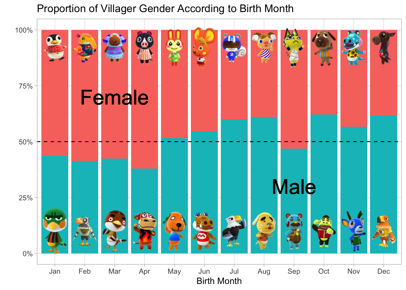
I have no experience with Animal Crossings, but through this exploration, we do see that female characters tend to be born in the first few months of they year and male characters tend to have birth months towards the later part of the year. There is nothing definitive to say why this may be the case outside of random chance. However, I was able to expore some plotting options in ggplot through this simplistic data exploration.
Setup Script for this Rmarkdown document:
knitr::opts_chunk$set(echo = TRUE)
knitr::opts_chunk$set(message = FALSE)
knitr::opts_chunk$set(warning = FALSE)

library(tidyverse)
library(scales)
library(stringr)
library(tidyr)
library(lubridate)
library(tidytext)
library(magick)
library(cowplot)

ggplot2::theme_set(theme_light())

# Function to add colored text to the document

colorize <- function(x, color) {
  if (knitr::is_latex_output()) {
    sprintf("\\textcolor{%s}{%s}", color, x)
  } else if (knitr::is_html_output()) {
    sprintf("<span style='color: %s;'>%s</span>", color,
      x)
  } else x
}
Andrew G Farina
Academy Professor
My research interests include leadership (risk-taking propensity | appraisal) and character (intentional self-regulation) development.