Volcano Eruptions
Overview
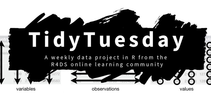
These data are from the #TidyTuesday (12 May 2020) project. Tidy Tuesday is a weekly data project aimed at the R ecosystem. As this project was borne out of the R4DS Online Learning Community and the R for Data Science textbook, an emphasis was placed on understanding how to summarize and arrange data to make meaningful charts with {ggplot2}, {tidyr}, {dplyr}, and other tools in the {tidyverse} ecosystem.
The intent of Tidy Tuesday is to provide a safe and supportive forum for individuals to practice their wrangling and data visualization skills independent of drawing conclusions. While we understand that the two are related, the focus of this practice is purely on building skills with real-world data.
Volcano Eruptions
The data this week comes from The Smithsonian Institution.
Axios put together a lovely plot of volcano eruptions since Krakatoa (after 1883) by elevation and type.
For more information about volcanoes check out the below Wikipedia article or specifically about VEI (Volcano Explosivity Index) see the Wikipedia article here. Lastly, Google Earth has an interactive site on “10,000 Years of Volcanoes”!
Per Wikipedia:
Get the Data
volcano <- readr::read_csv('https://raw.githubusercontent.com/rfordatascience/tidytuesday/master/data/2020/2020-05-12/volcano.csv')
eruptions <- readr::read_csv('https://raw.githubusercontent.com/rfordatascience/tidytuesday/master/data/2020/2020-05-12/eruptions.csv')
I may want to group the data by continent. To do this, I will scrape an HTML table from statistic times and modify some of the country names to coincide with the country names in our datasets
url <- 'http://statisticstimes.com/geography/countries-by-continents.php'

webpage <- read_html(url)
tbls <- html_nodes(webpage, "table")
country <- webpage %>%
        html_nodes("table") %>%
        .[3] %>%
        html_table(fill = TRUE) %>%
  .[[1]] %>% select(country = "Country or Area", continent = Continent) %>%
  mutate(country = ifelse(country == "United States of America", "United States", country),
         country = ifelse(country == "Russian Federation", "Russia", country),
         country = ifelse(country == "Democratic Republic of the Congo", "DR Congo", country),
         country = ifelse(country == "Chile", "Chile-Argentina", country),
         country = ifelse(country == "United Kingdom of Great Britain and Northern Ireland", "United Kingdom", country),
         country = ifelse(country == "Cabo Verde", "Cape Verde", country)) %>%
  rbind(., c("Chile", "South America"))
Eruptions per half-decade
These two datasets are very interesting. I am going to try to use gganimate for the first time with these data to plot the number of volcanic eruptions each half-decade (I originally did this by year, however, the data was quite noisy, grouping by half-decade seems to smooth it out without oversmoothing). To do this, I will use the eruptions dataset and plot the starting year of the eruptions. I will limit the data to only include 1600 to 2019 (Not sure how well we captured volcanic eruptions prior to 1900 but we will see how it looks). I have also removed the current year as it is not a complete datapoint at the time of this writing.
year <- eruptions %>%
  filter(start_year >= 1600 & start_year < 2020) %>%
  mutate(year = year(as_date(glue::glue("{start_year}0101"))),
         decade = year - (year %% 10),
         half_decade = year - (year %% 5))

#I explored grouping by volcano type and also country and continent, however, the plots were messy and it did not illuminate more than the simple graph of all activity.

year_type <- volcano %>% select(volcano_number, primary_volcano_type, country) %>% left_join(year, .)
year_type_continent <- left_join(year_type, country, by = c("country"))

year_type_continent %>%
  ggplot(aes(x = half_decade)) +
  geom_line(aes(), stat = "count", color = "DarkRed") +
  labs(title = "Reported Volcanic Eruptions by Half-Decade",
       caption = "For Years 1600-2019",
       y = "Reported Eruptions",
       x = "") +
  transition_reveal(along = half_decade) +
  ease_aes('linear')
This is interesting as it shows a general trend towards more volcanic activity until about 1950, then it levels off. Clearly, I would be careful to make inferences based on this graph as we do not have any background in volcanic activity detection. I cannot say whether volcanic eruption count is actually going up, or if our ability to detect this activity is just more refined.
Setup Script for this Rmarkdown document:
knitr::opts_chunk$set(echo = TRUE)
knitr::opts_chunk$set(message = FALSE)
knitr::opts_chunk$set(warning = FALSE)

library(tidyverse)
library(lubridate)
library(rvest)
library(gganimate)

ggplot2::theme_set(ggplot2::theme_linedraw(base_family = "Comic Sans MS", base_size=12))

# Function to add colored text to the document

colorize <- function(x, color) {
  if (knitr::is_latex_output()) {
    sprintf("\\textcolor{%s}{%s}", color, x)
  } else if (knitr::is_html_output()) {
    sprintf("<span style='color: %s;'>%s</span>", color,
      x)
  } else x
}
Andrew G Farina
Academy Professor
My research interests include leadership (risk-taking propensity | appraisal) and character (intentional self-regulation) development.