Descriptive Statistics
Descriptive statistics and data visualizations help researchers summarize and describe characteristics of their data, check for obvious irregularities, identify patterns, and gather important insight into how these data will behave during subsequent modeling efforts.
Frequency Tables
A frequency table displays data according to the number of times (frequency) in which these data exist in the dataset. The table is arranged in ascending order of magnitude.
Frequency tables should include the following columns:
x = Values of the raw data, arranged from high to low. These values are discrete and typically represented as factors or discrete numbers.
freq_x = Frequency of x.
freq_percent = Percentage of observations at each value of x.
cum_freq = Cumulative frequency of x. Shows the number of participants at or below the given value of x.
cum_percent = Cumulative percentage of observations that fall at or below the given value of x.
As an example, we will use the diamonds dataset from the {ggplot2} package to create a frequency table of the cut variable.
data("diamonds")

diamonds %>%
  mutate(cut = as_factor(cut)) %>%
  group_by(cut) %>%
  count() %>%
  ungroup() %>%
  rename(x = cut, freq = n) %>%
  arrange(freq) %>%
  mutate(freq_percent = scales::percent(freq/sum(.$freq)),
         cum_freq = cumsum(freq),
         cum_percent = scales::percent(cum_freq/sum(.$freq))) %>%
  arrange(-freq)
## # A tibble: 5 × 5
## x freq freq_percent cum_freq cum_percent
## <ord> <int> <chr> <int> <chr>
## 1 Ideal 21551 40.0% 53940 100.0%
## 2 Premium 13791 25.6% 32389 60.0%
## 3 Very Good 12082 22.4% 18598 34.5%
## 4 Good 4906 9.1% 6516 12.1%
## 5 Fair 1610 3.0% 1610 3.0%Data Visualization
Three methods are typically used for frequency visualization:
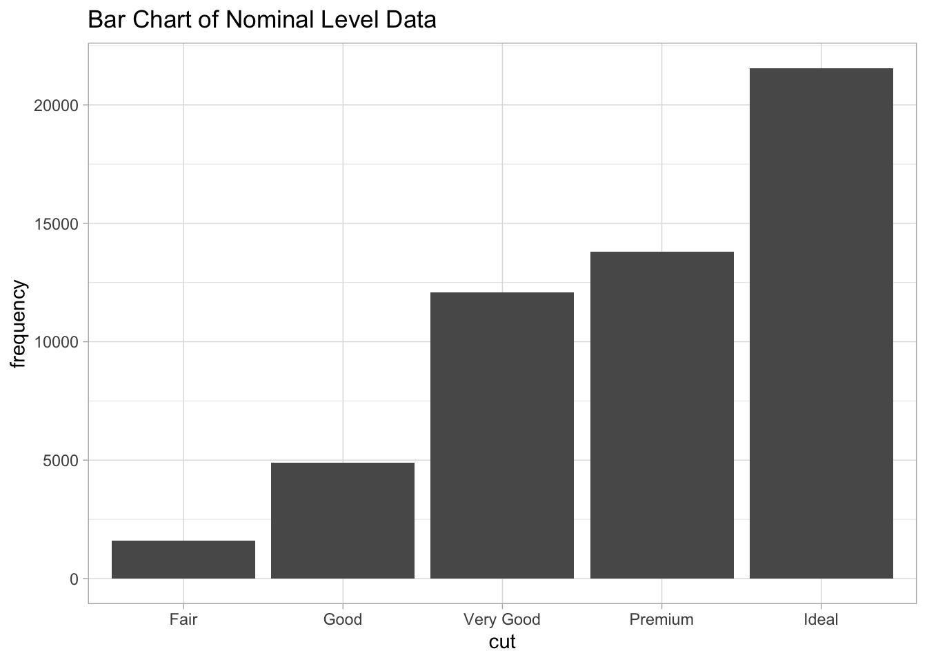
Bar charts (nominal level data)
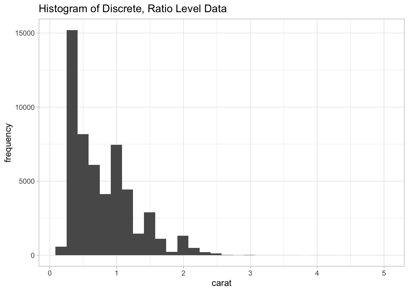
Histograms (ordinal level data or discrete interval, ratio level data)
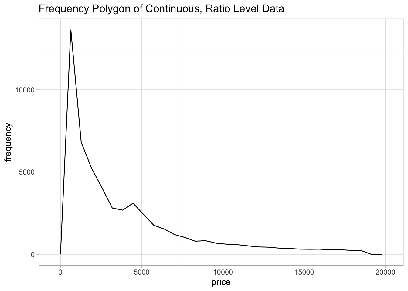
Frequency polygons (used for continuous interval, ratio level data).
Each of these visualizations can be created using the {ggplot2} package. We will use the diamonds dataset to explore each of these visualizations.
diamonds %>%
  ggplot(aes(x = cut)) +
  geom_bar() +
  labs(x = "cut", y = "frequency", title = "Bar Chart of Nominal Level Data")
diamonds %>%
  ggplot(aes(x = carat)) +
  geom_histogram() +
  labs(x = "carat", y = "frequency", title = "Histogram of Discrete, Ratio Level Data")
## `stat_bin()` using `bins = 30`. Pick better value with `binwidth`.
diamonds %>%
  ggplot(aes(x = price)) +
  geom_freqpoly() +
  labs(x = "price", y = "frequency", title = "Frequency Polygon of Continuous, Ratio Level Data")
## `stat_bin()` using `bins = 30`. Pick better value with `binwidth`.